Doing an HD Remake the Right Way : FFVI Edition
So Final Fantasy VI -- a beloved classic that contends with Final Fantasy VII for the title of best Final Fantasy game of all time -- is releasing on Steam this Wednesday. This game is the crown jewel of the SNES era of JRPG's and deserves the utmost care and respect.
Instead, Square Enix bungled it and everybody is complaining about the art style.
yeah pic.twitter.com/1UPgoUxgtE
— Jenn Frank (@jennfrankgames) December 9, 2015ffvi original vs steam release pic.twitter.com/38MSXa5Ds2
— Robin S. (@sickdooger) December 11, 2015I posted my own nuanced response on twitter as well:
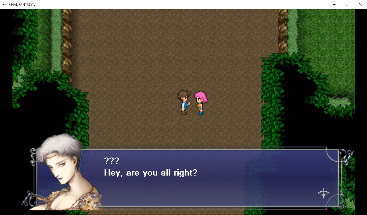
The problem with the Final Fantasy VI remake has much more to do with graphics programming than art style. (Direct image link
)

(We'll get back to this image later in the article.)
The Final Fantasy VI PC re-release is a direct port of an earlier iOS version. Final Fantasy V got the same treatment, used the same engine, and was also released on Steam a few months back. As you might expect, they share similar technical problems.
I had a lot to say about Final Fantasy V, so if you're reading this blog for the first time I recommend at least skimming the first article, in what has apparently just become a series:
Doing an HD Remake the Right Way
Back? Cool.
Now, before we begin, I want to address a discussion pattern I've seen:
ALICE: This art is terrible! Just give me the original pixel art at this point.
BOB: What's wrong with the new stuff? At least it's HD.
ALICE: Where are your eyes? See the smudging? You're such a phillistine.
BOB: What, you think ugly blocky pixels are better? You're such a snob.
What we have here is a failure to communicate.
Alice is trying to point out glaring problems with the technical implementation, but Bob just hears "Alice is a weird hipster who thinks grainy black and white silent films are better than digital HD in full color with surround sound." Meanwhile Bob is trying to say that literally anything looks better to him than pixel graphics because he wasn't born in 1984 -- but all Alice hears is, "Bob's inability to see these problems can only be explained by a congenital visual impairment that covers his entire field of view with jpeg artifacts."
Yeah, Alice and Bob are a bit strawmannish, but you've seen this argument play out before.
I'm not interested in telling Alice and Bob what they should or shouldn't like. I am interested in giving Alice and Bob a proper technical vocabulary so they can put their feelings into words.
In the end my central point is this:
This game could have -- and should have -- looked much better, regardless of whether you prefer HD art or pixels.
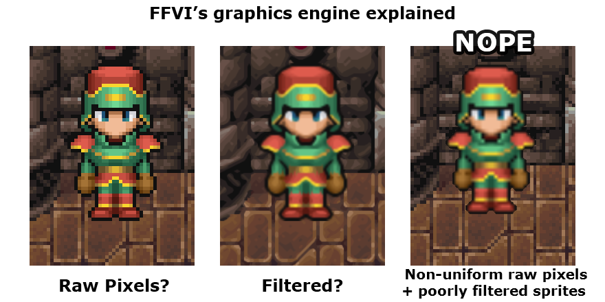
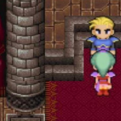
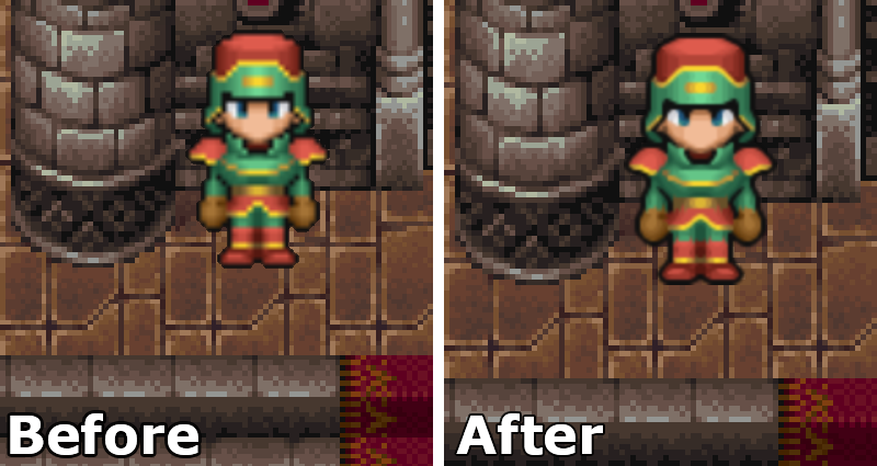
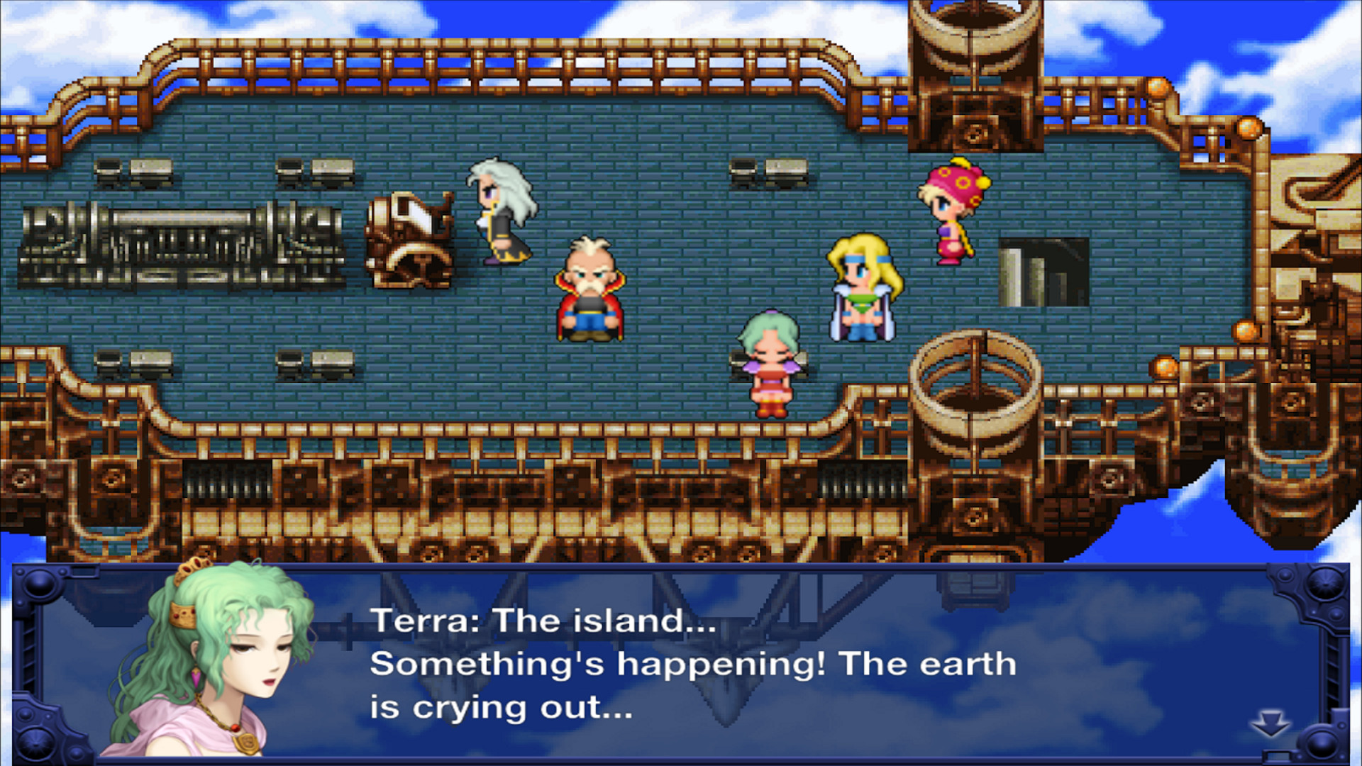
Anyways, let's start with an official screenshot from Square Enix.
Blurring
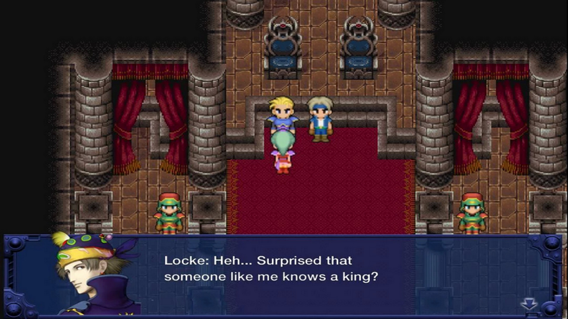
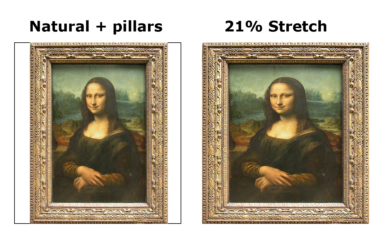
First of all, the entire screen is stretched horizontally by about 21%. In an official screenshot.
Yes, pedants, I know the Super Nintendo did not have a square pixel ratio. But this is a different matter. Locke's head and other visual elements are obviously distorted from the proportions the artists intended.
1920x1080 is the most common display size according to Steam's latest survey. It's the single most important resolution to get right. Yes, I know this was originally a mobile game with a native internal resolution of 1280x768, but seriously, put your best foot forward here, Square Enix.
Personally I feel that pillar-boxing is always better than stretching, but judge for yourself (Direct image link):
Next, everything on that FFVI screenshot is blurry. And just to reiterate -- in an official screenshot.
(NOTE: Since this blog has a tendency to auto-size images, especially if you're on a mobile device, I've cropped the following image to 400x400 so that it will hopefully show up at native resolution on all devices. Open it in a new tab if necessary.)
Take a look (Direct image link):
Note that I have not zoomed in at all. That's the exact per-pixel output you'll see on a 1920x1080p display.
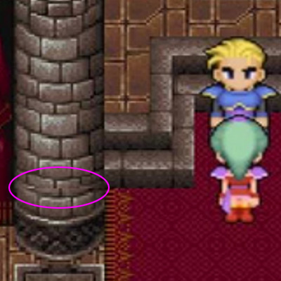
Also, notice the harsh tiling boundary artifact on this column (Direct image link):
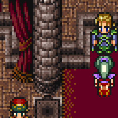
Here's how the original looks, for comparison (Direct image link):
Now check this detail out (Direct image link):
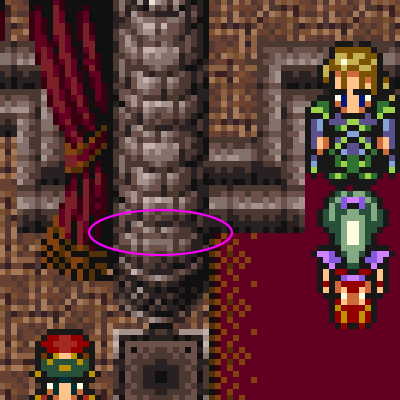
From the looks of it, the new tile art was done by taking the original pixels and drawing higher resolution versions of them. The problem with this is that pixel art inherently lacks detail -- so this little pixelated seam blends because everything's blocky already -- a stray pixel still reads as a chunk of mortar, a highlight, a shadow, or a bit of texture.
But when you go to HD, suddenly you lose your ability to fudge things. You don't have a few pixels that represent a brick, you just have a brick. And if it's weirdly sliced in two with a boundary that doesn't line up, that just looks wrong. If I had to guess, the artists worked on the tilesets one tile at a time without paying much attention to how they would be composed in game.
Next, look at these artifacts: aliased (that is to say, "blocky") pixels are clearly visible, but blurred into an ugly, smudgy mess (Direct image link).
![]()
Again, I am not zooming in here at all! This is exactly how it shows up on your 1920x1080 display right in front of your face!
Grabbing this screenshot from the iOS version shows where the problem is coming from (Direct image link):
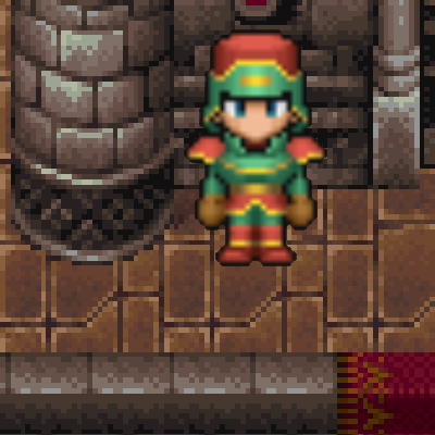
This is how the game is "meant" to be displayed natively, which will only occur if your native display matches the internal resolution.
NOTE: This screenshot is probably from a retina build of the mobile game, because the original internal resolution of this engine (which is what the PC build uses) seems to be 1280x768.
The character sprites are drawn as high-res pixel art, but scaled with some sort of filter. However, the game tiles themselves are drawn with pixel art but left unfiltered. Then, the fit-to-screen scaler kicks in and throws another bilinear filter on top of everything and disproportionately stretches it to whatever you've got.
Also, if you look closely, you'll notice that even those "native" blocky pixels are awkwardly stretched -- some of them are 5x5, some of them are 4x5, which implies sloppy nearest-neighbor (ie, "blocky") tile scaling.
Either the developers have poor crafstmanship, or they're trying to match the non-square pixel ratio of the original SNES. If it's the former that's just plain bad. If it's the latter, that's bad and crazy. I mean, you're making new art from scratch, for a display with 1:1 pixels! What are you doing hard-scaling the ratio at the last minute? That's like carefully carving a beautiful wooden door only to find it's an inch too wide for the frame and just brutally hammering it until it fits.
Okay, remember this image? Let's get back to it (Direct image link).
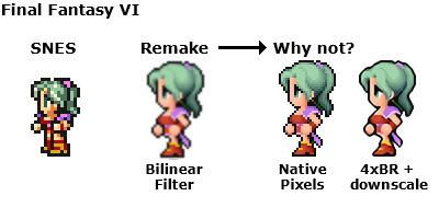
Some people prefer blocky pixels, some people prefer smooth HD gradients, but taking blocky pixel art and applying a bilinear filter is literally the worst of both worlds.
The very least the developers could have done was to upscale the high-res sprites with the XBR algorithm by 2x or 4x, and then downscale with bicubic filtering, and save that as the new master asset. This effectively anti-aliases the image, and since the sprites are fairly high resolution to begin with, the results are pretty good. This way, if any bilinear filtering is applied on the entire game screen, the results won't be as bad because there will be no blocky pixels to smudge. Things would still be blurry, but tolerable.
But why tell you when I can show you?
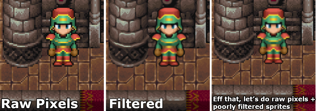
Here's how the raw pixels would look if everything had just been given a clean nearest-neighbor 4x scale (Direct image link):
![]()
Certainly blocky, but admittedly higher res than the SNES, and the art styles are internally consistent.
Here's how it would look if instead of bilinear filtering the sprite art, you antialiased it with an XBR upscale and a bicubic downscale. Swap that in, and it looks like this (Direct image link):
![]()
Not perfect, and it's still standing out against a pixelated background, but compare (Direct image link):
I don't generally agree with taking raw pixels, upscaling them with a filter, and then matting them against raw, unfiltered pixels, but if you're going to do that, at least do it the least worst way.
And while I'm at it, may I suggest trying for consistency? (Direct image link)
At this point it should be clear that the new pixel resolution simply isn't enough to achieve respectable detail at 1080p without some trade-off between artifacts, blurring, or blockiness. But even so, they could have at least given us some options such as unfiltered raw pixels, or letting us pick from a list of upscaling algorithms.
Oh, and on top of this mess they're then scaling the entire screen with another blinear filter with no regards for proportion.
The next two issues people complained about were the portrait sprites, and the art direction behind the new character sprites themselves.
Portraits
The portraits in FFVI are much better than what we had to deal with in FFV (Direct image link):
(That's supposed to be the brown-haired boy on the left talking).
As I mentioned in the previous article, this mismatch came from taking the original concept art done by legendary artist Yoshitako Amano (known for his ethereal and androgynous watercolor style), and plonking it straight into the game with no concern for the existing style.
Things look better in FFVI (awful stretching aside) (Direct image link):
This is almost certainly because unlike Final Fantasy V, the original Final Fantasy VI featured pixel art interpretations of Amano's concept art in the original game, which provided a clear direction to work from (Direct image link).
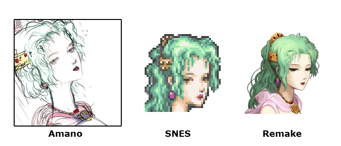
These portraits are gorgeous and highly detailed! There's two problems that remain, however:
1) Only one expression per character.
FFVI is famous for its melodrama, action, and emotional swings, with lots of rich dialogue, varied characters, and expressive sprites. However, whether Terra is pouring her heart out to a confidant about her bitter past, or courageously standing up to an evil madman, her portrait will have the same blank stare. The original game only used portraits in the party screen, so they were never designed to match the full range of the character's expressions in game. So taking these portraits and showing them alongside every line of dialogue can lead to some emotional dissonance.
Of course, the mobile/PC version of FFVI wasn't the first to do this -- the GBA version had the same feature (Direct image link):
2) Three competing art styles on every screen.
The real fundamental issue behind the new FFV and FFVI remakes is that when everything is scaled up to HD, the discrepancies between portrait art, tile art, and sprite art become glaring. Individually each one might look alright, but together it's a mess.
Character Sprites
Some people on my side of this issue have attacked the new sprite art style as cartoonish, bland, etc. I think that's a bridge too far (Direct image link):
![]()
These sprites, viewed at their proper proportion, without obtrusive filtering, and in their own context, look pretty nice!
Sure, they're not as jaw-droppingly gorgeous as the sprites from the PSP remake of FFIV (Direct image link):
But they're still pretty good!
Here's a version I made with my XBR antialias trick, in case the blog feels like applying bilinear filtering to our precious clean pixels (Direct image link):
![]()
(Not perfect, but better than bilinear filtering!)
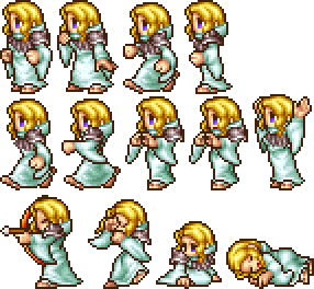
They're animated, they're colorful, lively, and if we're being completely fair, they are done by the same sprite artist that did the SNES versions, Kazuko Shibuya, and closely match the "chibi" concept art for the original sprites (which apparently she created as well) (Direct image link).
There are certainly some nits I can pick. There's a few too many soft gradients when I'd prefer sharp contrast (like in the physical chibi art). The sprites also look a little flat. Tweak the colors. Watch out for lighting that sometimes approaches pillow-shading. Etc.
From a technical perspective, I think it would have been smarter for the developers to have gone with a resolution 4x higher than the original rather than just 2x. That way you can downscale from there rather than butchering everything with selective upscaling and ugly filters.
From an artistic perspective, the sprites, when paired with everything else, have crossed a little into the uncanny valley. Even though the sprite art is quite faithful to the original style (you literally can't get any more faithful than the original artist and chibi concept art!), the tile art doesn't match - they look like art assets from two different games. Throw in the portraits as a third competing element, and it really starts to grate. In the world of pixel art this doesn't happen so often because the sheer brutality of low-resolution pixels creates a "mosaic effect" that tends to unify everything.
Again, simple tweaks like avoiding bilinear filtering on blocky pixel edges would go a long way towards smoothing the worst of these issues over.
Big Words, Smart Guy
Okay, okay, I get it. Even though there are some things I like about the new FFVI, I'm throwing out some pretty harsh criticism on the remake of a beloved title that a lot of people worked hard on.
As the saying goes, "you can dish it out, but can you take it?"
I hope so!
My experience in doing HD remakes comes from working on an upgrade to my own game, Defender's Quest: Valley of the Forgotten, which will release sometime early next year as a free upgrade to existing owners. I've described most of the special techniques I used in the previous "Doing an HD Remake the Right Way" article, so if you skipped that and want to see if I can live up to my own standards, I suggest giving that a read now.
But there's at least one new tip I've come up with since, which was the direct result of feedback in the comments from last article: properly avoiding nearest-neighbor scaling artifacts in 1080p mode when using the original (pixelated) sprite art.
The context for this, which you can read about in the original article, is that in 1080p mode, my battlefield was just slighty too short to fit at a clean 2x scale (the minimum size required for a good looking nearest neighbor scale). However, showing it at 1:1 at that resolution would be way too small and leave too much empty space.
(The original battlefield was 560 pixels tall, requiring 1120 for 2x -- a full 40 pixels too many!)
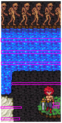
I had found that by shrinking my subtile size from 20 to 19 I could just make it -- that would make my 2x sized battlefield fit at 1064, with 16 pixels to spare. Normally doing nearest-neighbor scaling will create ugly, obvious artifacts, but I figured scrunching a 20x20 subtile down to 19x19 would be pretty subtle and wouldn't hurt too bad -- HD on the left, pixels on the right: (Direct image link)
![]()
Here's some links to the full 1080p HD and Pixel-art screenshots.
As those of you with a trained eye can see, of course, there's clear nearest neighbor artifacts in the 20x20->19x19 scrunched tiles image (Direct image link):
Ultimately there was no clever trick around it. I created a separate set of 19x19 image tiles and put in some code to detect when the engine should use them instead of the normal ones. Fortunately, I was able to automate the process of creating the 19x19 tiles. Using some Photoshop actions in conjunction with content-aware scaling, I was able to batch-create all my tiles with a single script recorded from stepping through the process manually once.
Now that problem is fixed! (Direct image link):
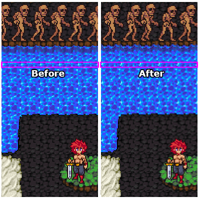
This still isn't perfect -- if you look closely you can see the berserker is half a pixel off in alignment with the terrain -- I'll be sure to fix that in a future build.
There were other complaints, like our algorithmically upscaled tile art, which is fair. We've got an artist working on a cleanup pass of the overworld which should be much more detailed, and if we have the budget we'll look into doing the battle tiles, too. As an indie there's only so many resources you can put into fresh high-res art, hence my emphasis on "doing the best with the art you've got" programming techniques.
But this time, we have more than just screenshots of the game for you to criticize. Earlier this month, we released a public demo build of DQHD. You can play it right now and tell us everything that's wrong with it, and if it's not super expensive to do, we'll probably fix it!
Defender's Quest HD public demo
A few caveats --
That said, it's basically a complete experience and should give you a pretty good idea of what the final game will be like, (with the understanding that we'll fix as many bugs as we can and probably improve the graphics a wee bit more before final release).
(You can report bugs and issues on our github page and/or our forums -- though github is best.)
Now have at you, Internet! I fear not your sharp and pointy opinions that I probably totally have coming!
*ducks for cover*