MAKING A VIDEOGAME COVER THAT DOESN'T SUCK

We just made a new cover for our game's upcoming console release, and that got us thinking about making covers in general.
Ooooooh so shiny!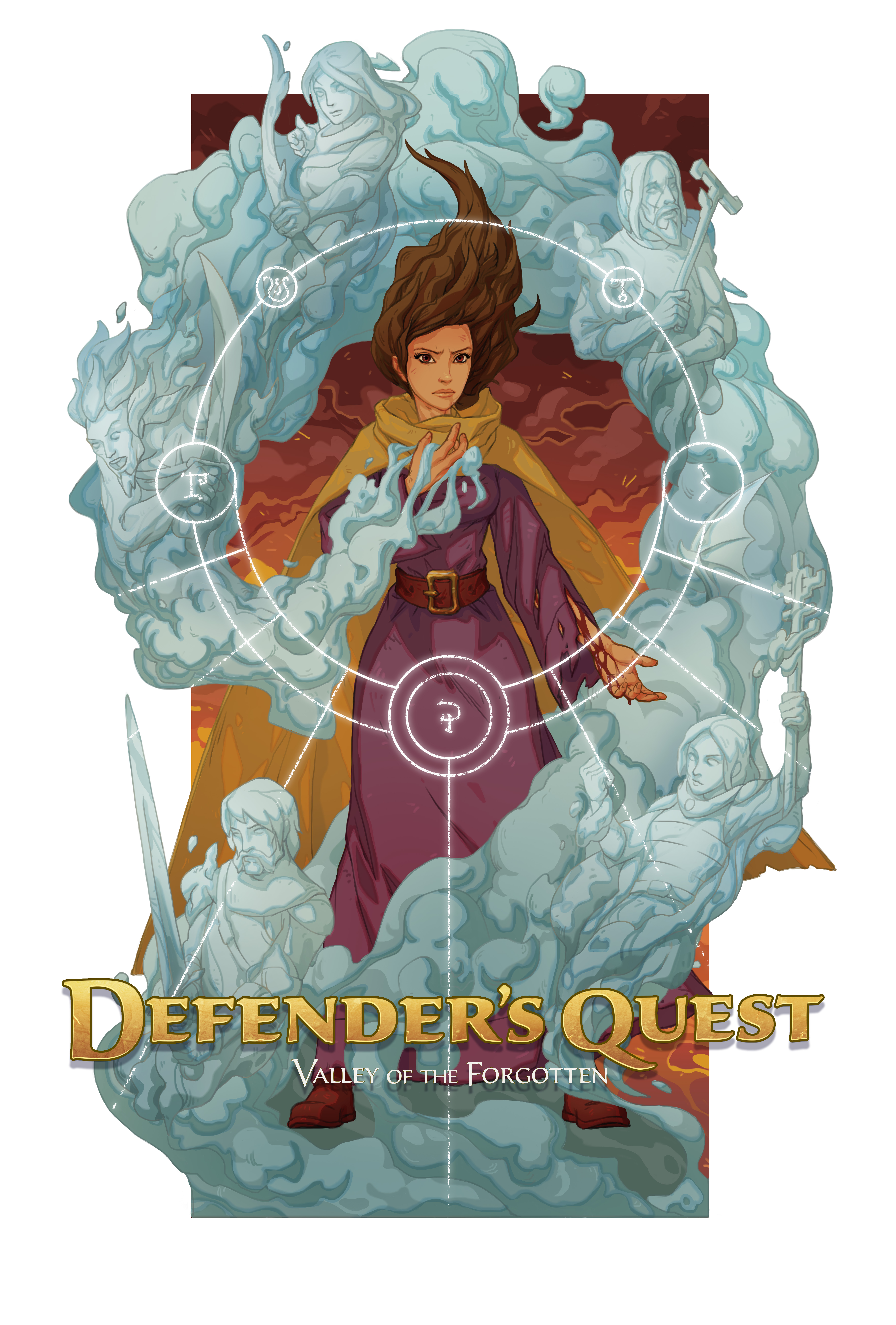
There are many ways to design a videogame cover. Most of them suck. We stumbled across one that didn't. Here it is.
Hi, my name's James, I've had 4 cups of coffee (and one cup of Bourbon), and I'm here to tell you how to make covers for video games despite having no formal education on the subject whatsoever.
Also, I'm the writer for Level Up Labs' Defender's Quest series. (Which I do have a formal education for! #creativewritingmajor #livinginacardboardbox)
You want a cover that doesn't suck for your game that doesn't suck. (Or maybe your game does suck – all the more reason to have a cover that doesn't! People buy asparagus all the time even though asparagus sucks majorly, because the picture on the asparagus container shows asparagus wrapped in bacon and slathered in butter and held on a golden platter by a smooth-chested pool boy and I forgot where I was going with this analogy so let's just skip ahead.)
First off, let's talk about the wrong way to do things, because negativity is the strongest power on the Internet and I'm counting on it to pull you through the rest of this leviathan article.
WHAT WE DIDN'T WANT TO DO
So, obviously, the easy way out of this is to ask "What is the standard thing for my genre to do?" and then tell your artist to draw that. For example, Defender's Quest is a party-based tower defense RPG hybrid, so the sensible thing would be to create an exploding character salad face bouquet.
THE PROBLEM IS we aren't selling an awkward pile of characters. We're selling a game, and that contorted pile of bodies doesn't really communicate anything about it. (Unless your game is some sort of anime-themed Twister clone, in which case character salad is a perfect representation of your product and you no longer need to read this article and I'm going to stop talking now because a lot of sublimated childhood memories are starting to resurface.)
See, the top dogs can get away with face bouquet because everybody already knows what their games feel like.
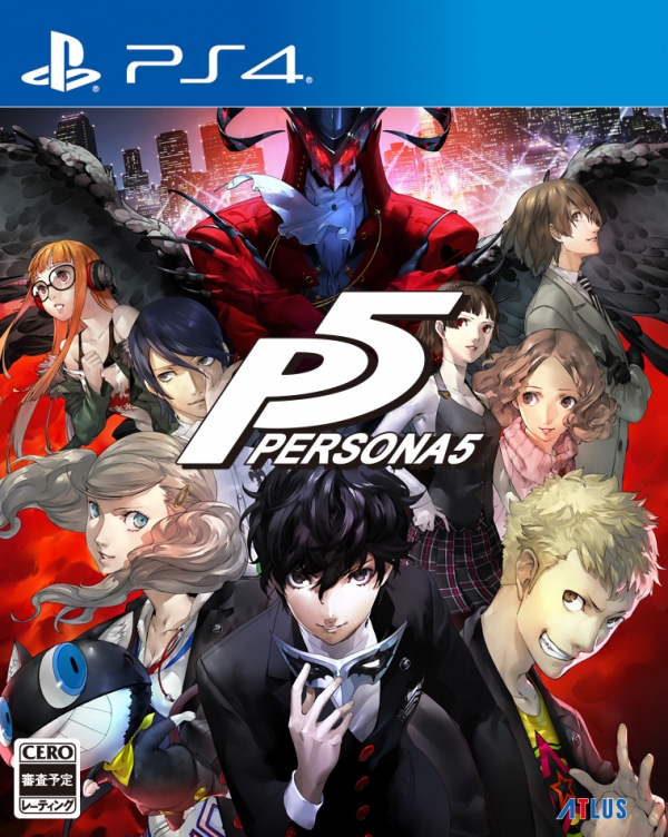
Oh snap! It's PERSONA! But with THESE NEW CHARACTERS! (Seriously, Persona, I would have your babies if it were physically possible and I wasn’t already in a committed, long-term relationship with Netflix.)
Anyways, the temptation is for all of us little fish to come along and say "Hey! This is what our genre is supposed to look like! Let's do that, but not as good because we're a couple of bedroom programmers with a shoestring budget!"
Then consumers look at it and say "Hey, this wants to be Persona, but made by a couple of bedroom programmers with a shoestring budget." Then they go buy Persona.
SO HOW DO YOU MOVE PAST THE GENRE STANDARD?
Your game is not just a clone of the genre leader – it's a crazy, unique experience that you poured your heart, soul, and sanity into, right?
So why waste your cover pretending that you're a genre leader clone?
For example, Defender's Quest isn't just another RPG – it's a narrative-driven party-based tower defense RPG hybrid where all of your tower defense "towers" are actually fully fledged RPG characters summoned by the protagonist to defend against waves of blah blah blah blah blah sales pitch blah blah follow this link and buy my game already.
The point is, if we just barfed character salad onto the cover and called it a day, we wouldn't be conveying anything about our game or why you should buy it.
We made a super rad game! We wanted super rad cover art to go with it!
Well, we tried. A bunch.
WHAT WE WERE DOING (AND WHY IT WASN'T AS AWESOME AS IT COULD HAVE BEEN)
As the lead/only writer of the Defender's Quest series (leading a team of one, baby!) I've directed a lot of different artists to make a lot of different images over the ages. Case in point: early on I directed the spectacularly talented Karen Petrasko to create this piece of artwork (which is now our title screen):
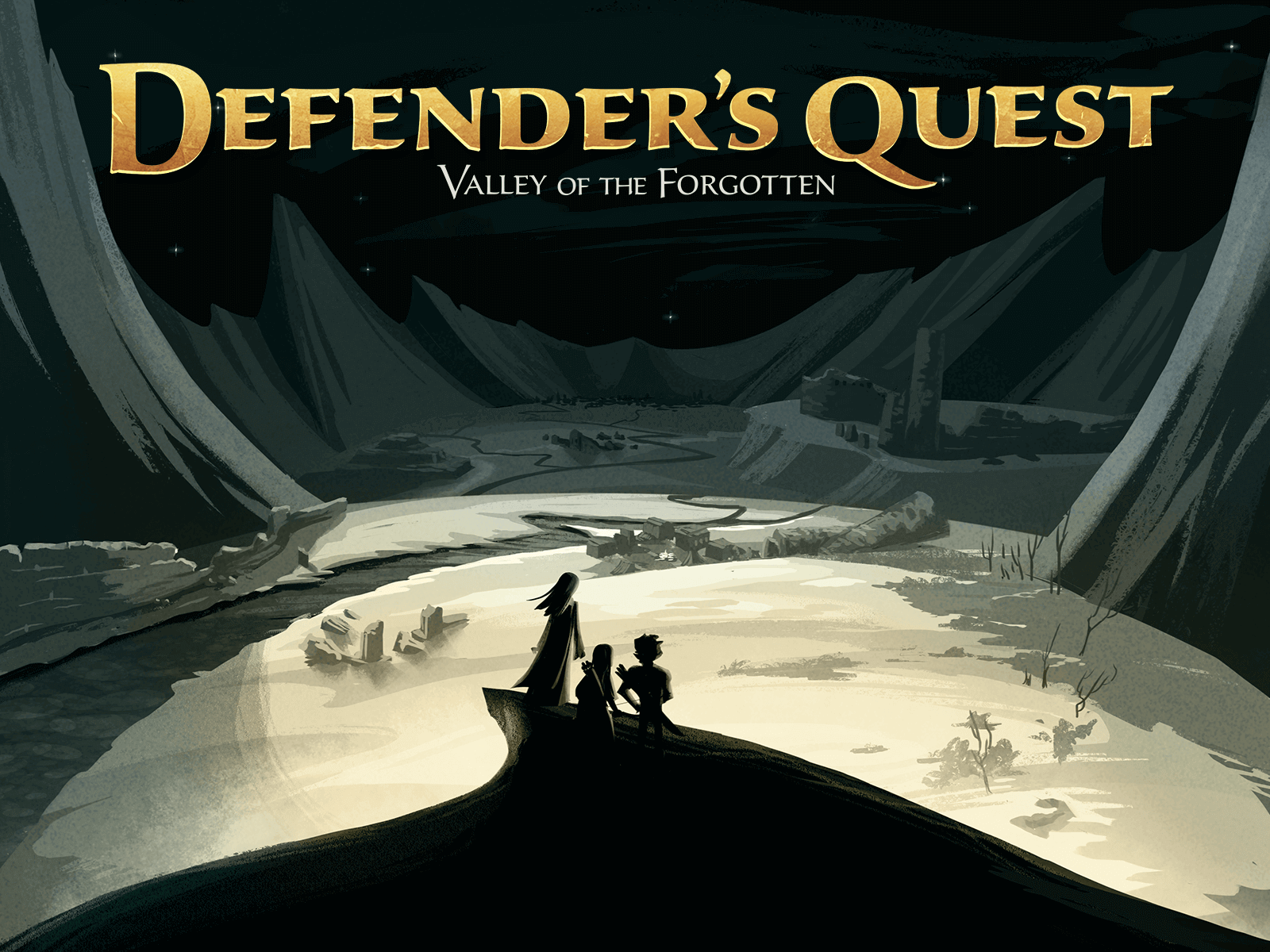
I gave her some mockups and explained that I wanted to capture the feeling of "these tiny characters being swallowed by this gigantic towering landscape opening up in front of them."
I absolutely love this image. It's brilliantly executed, and conveys all the driving emotions of our story – a ragtag band of misfit survivors struggling to escape a surreal, mysterious, post-apocalyptic medieval plague colony while dodging the blah blah blah elevator pitch blah blah blah buy the game.
It's a great picture.
It would also make a terrible cover for our game.
You see, what I never realized was that I was telling artists to draw entirely the wrong things.
THE SHOCKING AND TOTALLY UNEXPECTED INSPIRATION TO DO BETTER STUFF
Well, I would've gone on forever in blissful ignorance of what I was doing wrong if it weren't for one piece of total happenstance.
I was clicking around the webbernets one day looking at fan art of our game for completely normal, non-narcissistic reasons, when I stumbled across this gob-smacking piece from the cool cats over at Endless Fluff (of Valdis Story fame):
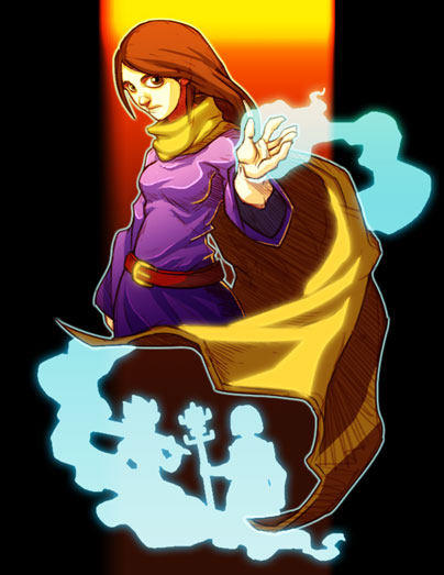
I stared at this thing and asked myself "Why doesn't our cover look like this?"
Somehow, this tiny bit of fan art from a fellow developer WAS A BETTER COVER THAN ANYTHING THAT WE HAD MANAGED TO MAKE WITH TIME AND MONEY AND OBSESSIVELY DIRECTING SUPERTALENTED PROFESSIONAL ARTISTS.
I had been telling people to draw the wrong thing. You see, I had been directing our artists to capture plot points and story motivations – all the stuff that I, as a creator, thought was important.
What Endless Fluff had made was a picture that captured WHAT IT FEELS LIKE TO PLAY THE GAME.
ANALYZING WHY IT WORKED
As you may remember from my super subtle sales pitch earlier, Defender's Quest: Valley of the Forgotten is a tower defense RPG hybrid where a suddenly-magical player character, Azra, summons a party of persistent RPG characters to defend herself against waves of monstrous enemies with an occult interest in her blood for mysterious (and nefarious!) purposes in fast-paced tower defense style battles, all while trying to escape a harsh, desert plague colony full of mystery and magic and other exciting selling points!
Let's take a look at those two pieces of art again: the one that I spent hours directing someone to make, and the one that someone made in an afternoon because they enjoyed the game.
Which one of these communicates anything that I just talked about?
Spoiler alert: it's Endless Fluff's fan art.
First off, it has a single strong central character – anybody looking at this immediately knows that this person is of vital importance (reinforced by the fact that Azra is looking at the viewer– there's no question that she's the focus). (Also, her eyes making contact with the viewer avoids the cardinal cover sin of having your character look "offscreen" and so draw the viewer's eyes away from your product and to whatever is sitting next to it on the shelf.)
The sundrenched gradient background conveys the FEEL of a desert environment without actually getting bogged down representing any details of a desert environment at all. (It also harkens back to the glory days of the SNES when RPG's were all golden and colorful.) It immediately gives things an air of a vibrant, exotic adventure, but with no visual detail to distract the viewer – it's just pure emotion.
The glowing hand with the blue magic-y stuff immediately tells us that MAGIC is important. (And the blue contrasts amazingly well with the colors of both Azra and the background.)
The striking silhouettes of characters coming out of the magic (which is coming out of the central character) immediately suggests our core mechanic: the central character is SUMMONING PEOPLE!
WHAT IS THE FEELING OF YOUR GAME?
Here's a crazy thought experiment:
Think of playing your game.
Now write down the first words that pop into your head.
After seeing Endless Fluff's fan art, I asked Lars Doucet, designer and programmer extraordinaire on Defender's Quest, to do this for our game. Without a moment's hesitation he told me: "Magic, Summon, Blood, Desert, Ghost, revenant, King, story, field, quest, sword, rippling abs, cloak, journey, travel, fire…"
Then I went back and looked at the piece of art that I had asked Karen to make. It communicated basically none of those points.
Now go back and look at that fan art again. Holy macaroni balls, just look at that thing! It evokes the FEELING of Defender's Quest better than anything I've made! It's simple, it's striking, it has some absolutely excellent framing and contrast, and it captures a TON of the things we wanted our cover to convey. It wasn't hung up on capturing the emotions and key plot points of the story, but on capturing what the game felt like to the person playing it.
After all, do you want your cover to say "Hey, this is, like, the emotions that the characters in this story are feeling" or "THIS IS WHAT IT FEELS LIKE TO PLAY THIS GAME DON'T YOU WANT TO FEEL LIKE THIS BUY IT ALREADY!!!"?
I'll give you a hint: you aren't trying to sell this product to your CHARACTERS.
THE THREE RULES
We decided then and there that we were going to change the way we made cover art.
First of all, we emailed Endless Fluff and said something like "DEAR HEAVENLY SOAPSUDS YOUR STUFF IS AMAZING CAN WE USE IT AS THE BASIS FOR OUR NEW COVER PRETTY PLEASE WE WILL LOVE YOU FOREVER?" They graciously, and enthusiastically, said yes.
Well, that was fantastic, but we didn't just want to copy Endless Fluff's fan art wholesale and call it a day – we wanted to figure out the underlying principles – we wanted to know WHY this thing worked so well. Then we wanted to harness those rules to make something EVEN BETTER.
Well, I hurled myself into study with the kind of neurotic obsession you would expect from a coffee/bourbon/sublimated-Twister-memories cocktail. After days of feverish research (and nights of horrible dreams about the repressed, Twister-induced sexual confusion of my early adolescence), I finally emerged with a GOAL, and THREE GUIDING PRINCIPLES to achieve it.
The goal: capture the FEELING of your game in a single image.
This image should tell you, at a glance, what it feels like to play your game. You aren't trying to create a PICTURE, you're trying to create a VISUAL EMOTION.
The THREE PRINCIPLES to achieve it:
1. Whoever decided Twister was an acceptable form of entertainment at my 13th birthday party sleepover should be taken out and shot and then fed to rabid weasels.
- Be simple and striking rather than detailed or complex.
- Identify the fundamental bullet points that define the FEEL of your game.
- Convey your most important bullet points and REMOVE anything that would distract from them.
Let's look at some examples, BECAUSE THERE AIN'T NO STUDY LIKE OBSESSIVE STUDY.
STRIKING versus COMPLEX
In our efforts to capture the feeling of Defender's Quest, we decided that DETAIL was far less important than creating a SIMPLE, STRIKING image that evokes an immediate EMOTIONAL RESPONSE in the viewer. In fact, detail, graphical fidelity, and other forms of visual busyness can actually undermine the ability of a cover image to effectively evoke an emotional response in the viewer. If the image is too complex, the analytical part of the brain that interprets visual complexity kicks in, and the viewer is too busy trying to decipher what they're looking at to have an immediate emotional response.
For example:
VERSUS

Both of these images are expressing similar emotions – dystopian violence and dissatisfaction, etc. – but the first image is so complex that the viewer has to work for the emotion. It engages the where's-Waldo-puzzle-solving part of the brain, and it's only after a certain amount of analysis that the viewer can find any sort of emotion. The BLEEDING HEART GRENADE image, on the other hand, skips analysis and goes straight for the FEELS. The image is simple enough that there's no deciphering or interpretation needed – it bypasses analysis and jumps straight to immediate emotional response. It's simple, it's iconic, and it's an infinitely better cover.
Capturing the FEELING of media by displaying its core elements and removing everything else
Movie posters are perhaps the best example of capturing the FEEL of a more complicated medium in a single static image. For example, let's look at Indiana Jones:
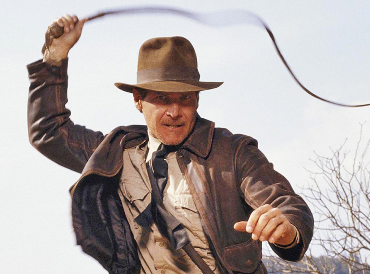
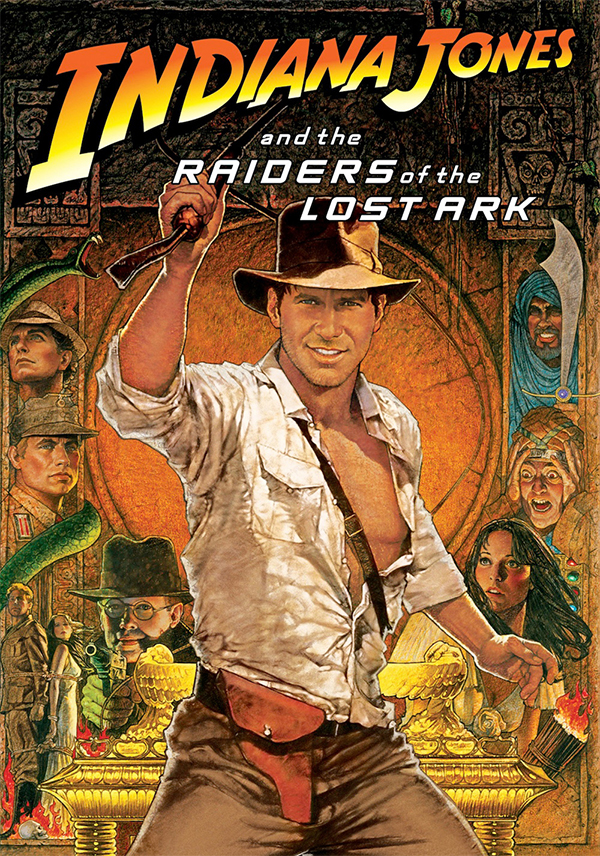
If all we were interested in was graphical fidelity, the still frame from the film would be perfect – this is exactly what Indiana Jones looks like in the movie. However, a single still frame can't tell you what it FEELS like to watch the movie. Instead, renowned poster artist Richard Amsel ignores graphical fidelity and goes for immediate emotional response. (It's worth noting that if you were to take Photoshop and perfectly re-create this poster using actual photographs of the actors instead of paintings, suddenly the magic is lost. The graphical complexity distracts the viewer and the emotion disappears – now it's just a pile of actors’ faces instead of the FEELING of Indiana Jones distilled into an image.)
The fantastic thing about the poster is that it elicits an emotion of adventure even if you haven't seen the movie – people completely new to Indiana Jones can look at that poster and say "I want to see the movie that makes me feel like that!"
Richard Amsel identified the core bullet points of what Indiana Jones FEELS like, displayed them, and then removed everything that could be a distraction.
What does it look like in practice?
Theorycraft is great and everything, but what does it look like if you actually try to make something with all of this stuff?
Well, it looks something like this:
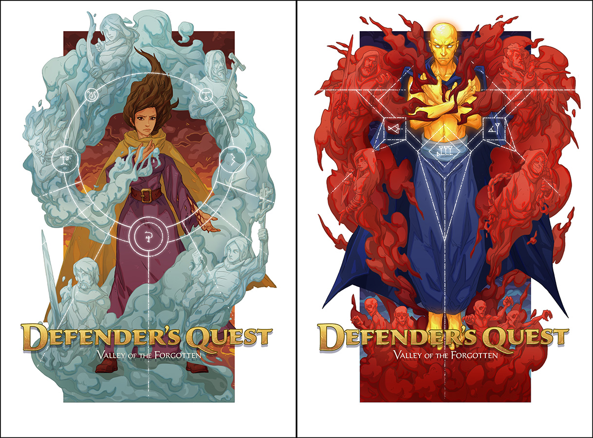
Using Endless Fluff's fantastic fan art as a springboard, we hired the fantabulously talented Egor Gafidov, and set about creating the VISUAL EMOTION of Defender's Quest.
Armed with the list of core bullet points that encapsulated the feeling of Defender's Quest, we went to work on three basic tasks:
-
Take the bullet points that were represented and see if we could make them even better. (More iconic posing for all of the characters, spiral composition to draw the viewer's eye in, etc.)
-
Remove anything that didn't support one of our bullet points. (Simplify detail, change to high contrast lighting that reinforces the sundrenched background, etc.)
-
Add any bullet points that were missing. (Party members, occult, blood, etc.)
It wasn't a walk in the park – I'm fast forwarding through several months of back-and-forth work with the artist – but the end result is something that ACTUALLY CAPTURES THE FEELING OF PLAYING THE GAME AT A GLANCE.
THE PERKS OF OBSESSIVE RESEARCH
Also, during my neurotic deep dive research binge into the world of movie posters I discovered this super neat thing where world-renowned poster artist Drew Struzan created the covers for the original Star Wars trilogy box set so that each movie had its own poster BUT then all three combined to create a massive Star Wars triptych!
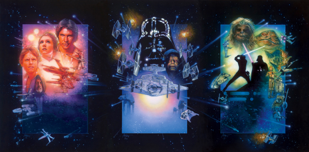
I immediately thought "That's so amazing I have no choice but to steal it at once!"
So we decided to make an alternate cover featuring our villain AND THEN WHEN YOU PUT THE TWO COVERS TOGETHER THEY VOLTRON INTO A FREAKING DIPTYCH OF AWESOMENESS.
This makes me so excited I should probably talk to a psychiatrist about it.
That's right, you shouldn't buy just one physical copy of Defender's Quest – YOU SHOULD BUY TWO OF THEM AND THEN TURN THEM INTO AN ART DISPLAY!
IN CONCLUSION
Anyways, that about wraps it up.
The lesson of the day is to:
STEAL THE IDEAS OF GREAT ARTISTS AND THEN WRITE A GIGANTIC ARTICLE PRESENTING THEM AS YOUR OWN YES LOOK AT ME SHOWER ME WITH ACCOLADES BWAHAHAHAHAHAHAHHAA IT'S ALMOST ENOUGH TO MAKE ME FORGET ABOUT THAT FATEFUL TWISTER GAME WHERE MATTHEW BRENNER SNEEZED IN SARAH LAWTON'S FACE AND THEN BOTH OF THEM FELL ON TOP OF ME AND MY TINY 13-YEAR-OLD BODY WAS CRUSHED UNDER THIS CONTORTED PILE OF WRITHING PUBESCENT AWKWARDNESS WHILE M-
Create a cover which captures the feeling of playing your game as a visual emotion by focusing on 1) simple, striking imagery that 2) conveys the core bullet points of your game and 3) removes anything else.