Collecting Details: Defender's Quest 2 Progress for September 2020
September's progress report includes changes to item design, status effect display, defender placement, and lots of other details.

Hey Defender's Quest fans, time for a quick update on what's changed since the last build.
Build version 0.0.13 is up on Steam for our early backers (Windows/Linux). Let's talk about what's new.
We touched a lot of little things in this build. Let's hit the highlights:
Improved Defender placement previews
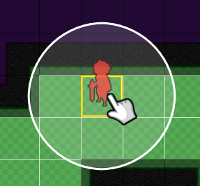
Just to make it crystal clear what terrain is and isn't possible to stand on, we've added the yellow preview square at the defender's feet when you try to place them:

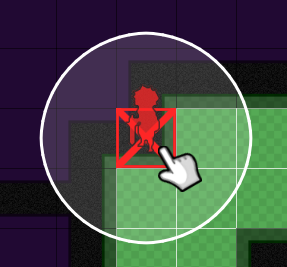
This turns to a red "X" when you're on an illegal spot. Previously we were just tinting the defender's silhouette red, which was too subtle already, and obviously didn't mesh well with the Black Hat's placeholder art, which is red by default. This makes things crystal clear regardless of what the final art style looks like, and further helps to distinguish "you can't place this character because of the terrain" with "you can't place this character because you don't have enough Juice."

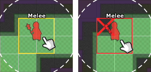
Furthermore, this feature is really essential for a 2x2 character like the Ultimate. They get their own special oversized placement box, which shows individual "X" squares highlighting which of the underlying squares is illegal to stand on.

New item stuff
Before this build, we hadn't really committed to the Ultimate and the Collector's item loadout. Rather than fiddle around too much with overlapping item classes we decided to keep it simple: each gets their own weapon class. These item classes are placeholder for now, it's about working out who can equip what kind of thing.

We've also made a bunch of individual changes to item shop schedules, moving things around to sync up better with character's skills and produce a more reasonable flow of helpful items to buy and give you interesting choices at each rest stop.
Status Display
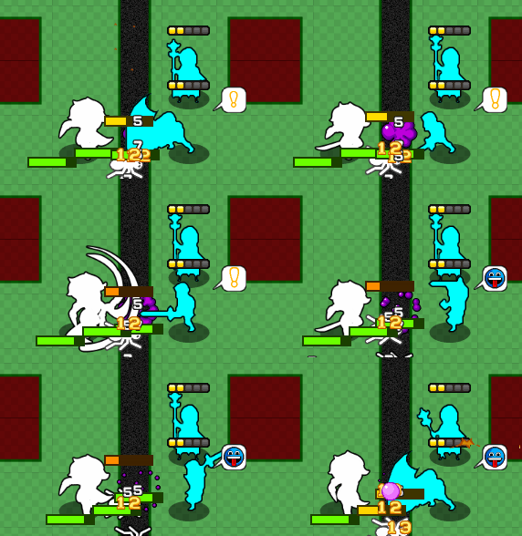
A constant battle with Tower Defense games is to communicate all the relevant information to the player concisely without everything turning into an incomprehensible soup of icons and numbers. We've been working on this in previous builds by moving certain status effects into visuals that are both easier to read and easier to stack, such as special animations for "zapped", as well as outlines for things like "harvest", and overlays for shields and fire. There are some things that just elude any kind of representation other than a simple icon, however, and these not only get easily lost in the chaos of battle, we quickly run out of room to stick them on characters.
So we're now moving to consolidate "generic" status icons into a status bubble, like this:

The status bubble rotates through all the various current statuses, and if you click on that character you can get a full display in their information panel.
I'm not 100% sure if I love this approach because I could see the flashing icons becoming annoying. I could backup to displaying some visual representation of how many status effects are active, I suppose. We'll see what people think.
We've also moved some battle designs around a bit and a done a variety of little bug fixes and tweaks here and there. See the changelog for more details.
Changelog spew:
- More focused/contextualized tutorials
- First boss battle: tell people they have a button to ignore the boss if they want
- Add support for "universal tutorials" that can happen anywhere
- First time eliminator is placed outside the proximity bonus zone (indicating a likely early-map strategy where poison is most effective), point out the optimize effects targeting button
- Tutorials should be smart enough not to obscure the object they are pointing at
- "Eliminator is taking hits" tutorial needs an arrow
- Tutorial should mention that Ultimate is a 2x2 character
- Clean up items/shops
- Change shop schedule: offer white splash weapons before gear
- Place 1 & Place 2 schedules should be swapped
- Place 2: move tutorial about gear
- Place 3: should have 1x cheap & 1x expensive weapon each for Jumper & Eliminator
- Expensive weapon: chill
- Expensive gear: give chance to dodge
- White hat armor: boost to regeneration
- Place 4 should offer items for collector & ultimate
- Collector should have a unique weapon class
- Ultimate should have a unique weapon class
- Make the bonus for weapons say "+1" instead of "1" so it's a clear increase over the default null weapon
- Duelist's blade: make critical flavor say "On critical, 2x damage..."
- Healer previews
- fix it so that buff connect lines appear correctly for square ranges
- fix bug where the preview disappears after a recall
- Make outlines shake with the enemy so they don't get desynced
- Defender placement
- show a square to show the placement zone
- show an "x" when the placement is illegal
- Ultimate needs a special 2x2 placement grid
- If any sub-square is illegal it should be highlighted individually
- Fix keyboard placement for ultimate
- Fix bug where the selectbox doesn't disappear on a canceled summon
- Status stuff
- Use "zapped" anim status for shock as well
- Add speech balloon carousel for generic icon-based status effects
- Taunt
- Inspire
- Battle changes:
- Collector intro: Don't require so much micro for Jumper, it distracts from collector's intro
- Take existing collector intro and use it later, introducing a simpler collector intro