Laser Lightning Bugs in the Spotlight: Defender's Quest 2 Progress for February 2020
This month, we're working on visual design language and gamefeel.

Howdy Defender's Quest fans!
Here's the monthly progress report for February. This month I've been devoting some particular attention to gamefeel and visual design language. Even though we don't have our official art in yet, I felt it was time to start working out some visual design problems.
Build version 0.0.8 will be up on Steam for our testers/alpha/beta backers tomorrow, and I will update this blog post when that's done. That's also when I'll send out the mailing list. So by the time most of you read this it will be ready.
Build version 0.0.8 is up on Steam for our testers/alpha/beta backers right now, for Windows and Linux. As for Mac, I've nearly made it through a long slog of battling with MacOS Catalina, which intentionally breaks a bunch of stuff and is a huge PITA for app developers. I hope to finish that soon, at which time I'll upload the Mac version.
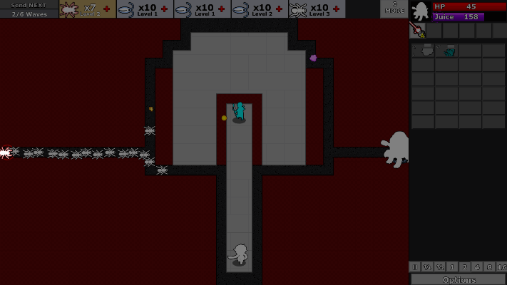
Here's a GIF that highlights several of this month's recent changes:
You're seeing a couple of things here.
For one, we have new placeholder art; I'm using a bunch of icons from The Noun Project. First, it's well past time we distance our game visually from DQ1 lest it serve as a subconscious mental anchor on our enemy design. Second, DQ1's design language was not great ("You know what screams "fast?" Slugs and Snails!) The new placeholder art lets us work out some design language issues now, and we'll get to that in a bit.
You'll notice that enemies now have proper selection outlines. Previously I was relying on a janky shader effect, but I've come to realize that in certain cases worse is better, and I already have this fancy system for layered enemies, so I just made a photoshop action that makes outlines, and gave every enemy an outline layer and they work super nice. Gonna use this for all sorts of things. All enemies have it in build 0.0.8, but only some of the defenders as of right now.
Oh, and I guess the turtle tank now has a giant laser cannon instead of the old DQ1 lightning. Although this is mostly a cosmetic change, it's important because a) it's more on theme for what DQ2's setting will be, b) electricity will be used elsewhere in DQ2 with some new properties, and I don't want to muddle things, and c) it's an opportunity for a cool new visual. It still has the thunder sound effect, though both that and the laser textures I'm using will likely change before final release. I tried using a generic laser sound but it lacked the same punch as the lightning's heavy bass, so I'll wait to replace it until I have our sound designer create a proper effect that serves equally well. Another thing I plan on doing soon is making a unique death animation for enemies killed with the laser cannon – since the laser cannon (like DQ1's lightning) burns off the Juice reward (Juice is DQ2's PSI), a killed enemy should burn up or evaporate or something, so it's more clear that you're not getting any tower defense money for killing them this way.
Okay! Now let's move on to another thing: enemy spotlight intros:
This is all placeholdery design, of course. The idea is, the first time you encounter a new enemy, the battle will pause, the enemy will be spotlighted, and you'll get a basic readout of the enemy's name, it's type, and its relative stats. This is all obviously WIP and we'll continue to refine it.
First, we want the encounter of a new enemy type to be its own kind of reward / pacing event. Second, we want to really clearly communicate what each enemy is and what it does. It was very common in DQ1 for new enemies to go completely unnoticed until a swarm of them was on top of you.
And yes, in future builds you'll be able to turn these off, and there will be an out of battle interface that lets you replay and review them (some sort of Bestiary).
Now let's talk about the visual design language of enemy archetypes:
So first of all, this is entirely placeholder stuff, and I'm not 100% happy with it. But it's good enough for now and a clear a step away from our old muddled DQ1 designs. (And it's all temporary anyways). My biggest nitpick is that I'm mixing some metaphors (wings don't imply flight, because we have no flying enemies), and that a lot of these icons are top-down views whereas DQ2 will have a 3/4's perspective – the Octopus works with that, the rest not so much. BUT WHATEVER, PLACEHOLDERS, let's talk a bit about visual design language.
My main goals with DQ2's final enemy visuals:
- Make the screen as readable as possible, even when it's crazy and packed
- Be able to tell what an enemy does at a glance
- Be able to pick out and prioritize threats at a glance
- Make different enemies look different
- Make similar enemies look similar (but not identical)
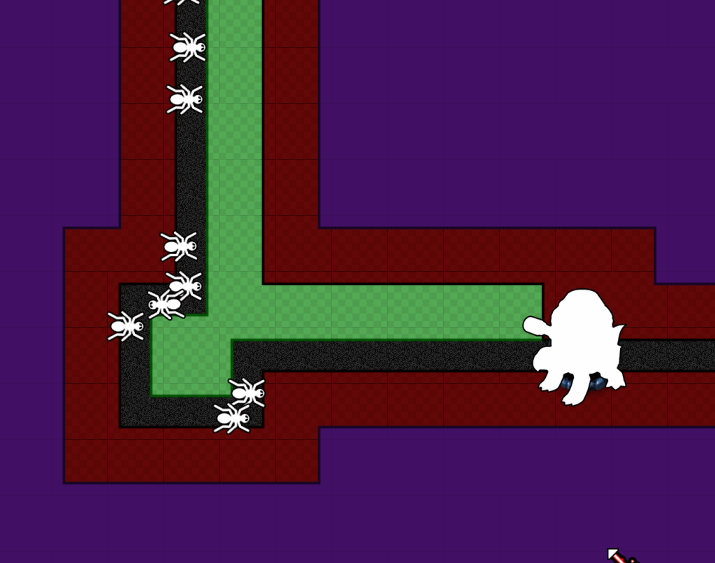
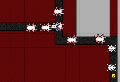
Our "normal" enemy (vanilla revenant in DQ1) is represented as an ANT. The noun project icon had mandibles and no eyes – I removed the mandibles because this enemy has no melee attack, and I painted on eyes so that you could tell which end was the front.
Our "fast" enemy (slugs/snails in DQ1) is represented as a ROACH. The noun project icon had six legs and very long antenna, I chopped off the legs to give it a distinguishable sillhouette from the ant, and shortened the antenna. I also gave it a colored outline so you could more easily pick out the fast enemies in a crowd.
Our "melee attacker" enemy (just red palette swapped revenant in DQ1) is represented as a STAG BEETLE. It looks superficially like the ant, but bigger, spikier, and with monster pinchers. You see this thing and it's obvious it wants to bite you. The red color scheme also helps it stand out in a crowd.
The "ranged attacker" is admittedly a muddle. In DQ1 these were our spitting snake-revenant with the gaping mouths. The best I could do for now was a FLY. I don't love the wings because they erroneously suggest flight, but they do give me a unique sillhouette which is important – this thing looks different.
The "fierce ranged attacker" builds on this. It's a wasp, so it looks similar to the fly, but it is clearly visually distinct, and that difference is accentuated by the violet coloring. This thing hits a lot harder and is harder to kill itself.
The "tough" enemy (a color swapped slug in DQ1) is represented as a ROLY POLY. These guys have lots of health, a bit of armor, and are slower than normal. I feel the metaphor works perfectly here.
The "swimming" enemy (just blue palette swapped revenant in DQ1) is represented as a FROG. They go on land, they go on water. Green outline and a unique sillhouette.
The "fast swimming" enemy (blue palette swapped slugs in DQ1) is represented as a TADPOLE. They go on land, they go on water, and they're fast. These are typically spawned by water-themed APC's. This is a bit muddled because tadpoles are fully aquatic in real life, maybe I'll stick little cartoon legs on them. Whatever.
The "boss" enemy is just a big violet OCTOPUS for now. (This was the "Monstrosity" blob monster in DQ1). This will be a temporary stand in for all of our boss types. I really want to push scale of bosses much further than we did in DQ1. They should have a lot of impressive heft and board presence.
The final enemy designs will not simply be these exact bugs, but with better art. Instead, think of this as a sort of sudoku puzzle I'm solving for visual communication requirements. The final enemy designs must be at least as clear and have the same visual relationships to each other as this new placeholder art.
Finally, another big change is the Long Shot's shrapnel shot. Now it's lightning shot.
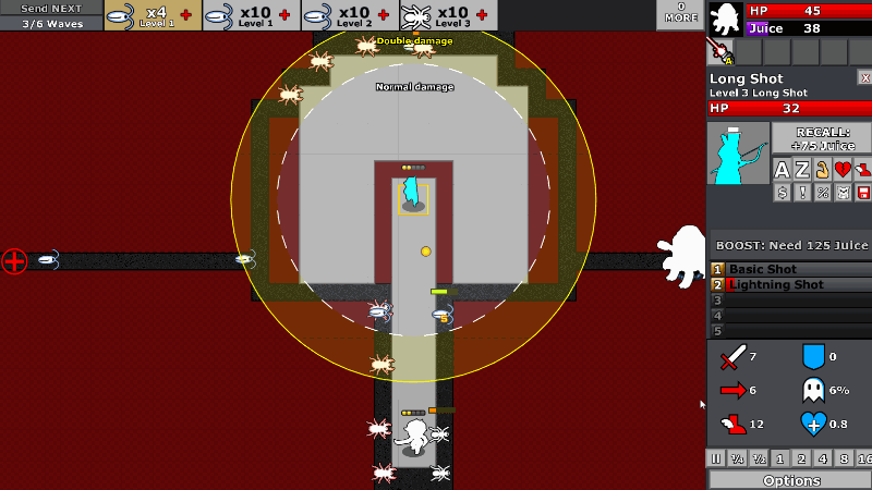
Previously, when shrapnel shot would hit an enemy, it would fire off four (or more) pieces of shrapnel in each cardinal direction. This was something that felt cool on paper, but had really bad gamefeel in practice.
Shrapnel was most likely to be visible when all four of them MISSED. When all the shrapnel hit (in a tight pack of enemies) you would see NOTHING.
This was the exact opposite of what we want! We want visuals to serve as proof that the cool skill you invested points into is working, and also have the visuals be a satisfying reward that makes you happy.
So now that attack will cause lightning to fork off of it. Instead of travelling in a straight line and probably missing, several cones will be projected in each direction, and if there's an enemy in a given cone, a lightning bolt strikes it. This flips it so that the more enemies you hit with the skill, the more visually satisfying it is. It also synergizes well with the long shot's theme – hitting things from a distance. This new attack now makes it more likely you'll be able to reach over and hit things far out of range. Plus, we made it reinforce another key theme of this character – double damage at long range. So if the lightning shot hits in the sweet spot, the lightning is thick and red instead of thin and blue, and you get double damage on the main attack AND the lightning branches.
Okay, I've babbled on for long enough, let's have the changelog spew:
- Fix a bunch of things with steamwrap
- Add non-shader outlines to enemies (and some defenders)
- Create baked outline effect
- Create tool to generate outline effects for old sprites
- Create photoshop action to generate it for new sprites
- Do it for all the enemies
- Fall back to old shader outline for cases where we don't yet have the new thing
- "You got" screen equip tweak
- Don't bother showing equip unless you have a choice to make (ie you have all slots equipped already)
- Design tweaks to certain levels
- Differentiate some terrain colors
- Add gold colored terrain to draw the eye in key places
- Illegal paths and terrain should not both be the same basic color (dark grey)
- Jumper intro level
- Reminder to boost jumper
- Shorten the "landing pads"
- Tweak enemy waves so there's a clear single "leading enemy" on lane switches as a "warning shot"
- Curve the spawn points around so you have more lead time react to what's going on
- Differentiate some terrain colors
- Chain lightning on long shot
- Add a 1-frame delay to each branch of lightning
- Communicate bonus damage on chain lightning
- If it's bonus, make lightning special color/thicker
- If it's not bonus, make lightning puny/thinner
- If it's bonus, make sure lightning damage numbers show critical style
- Change chill on lightning shot to something electric themed
- Add "zapped" status effect (chill, but for electricity)
- New design language/placeholder art for enemies
- Basic template
- Outline
- Do it for all the major types
- Normal
- Fast
- Attacker
- Fierce
- Ranged Attacker
- APC / Boss
- Armored
- Swimming
- Hydra Half
- Hydra Spawn
- New spotlight enemy introductions
- Pause on new enemy
- Animation in
- Show stats
- Show name/type
- Animation out
- Detect when enemy is new
- Consolidate barrier & reflect status effects
- Reflect should work on melee (merge reflect & barrier)
- Reflect should happen bEFORE any damage is reduced/resolved
- Make boost bar text more visible when greyed out
- Add new zapped status effect
- Swap lightning cannon for laser cannon
- Change the name
- Change the icon
- Implement the laser beam effect
- Remove electricity flavor
See you next month!