Powering through -- DQ2 Progress Report for September 2021
Everyone's been sick for over a month but somehow I managed to get some work done anyway

Howdy Defender's Quest fans!
So this past September has been the exact opposite of fun for my family. Everyone got sick (thankfully not with COVID), and then I got bronchitis which lingered for a solid month. And then my son had to go in for surgery (he's fine and in perfect health now, but it wasn't fun for anybody, least of all him). So everyone's doing fine now, but it's been a little bit grumpy around this house lately. Nevertheless, I somehow managed to attend to the responsibilities of my day job and also get a few things done on DQ2, which I'm calling a win.
This past month I was planning on getting a bunch of levels designed, but I settled for doing a bunch of "chore" tasks that I've been meaning to do for a while and also do some major design cleanup work on the "minion" system.
Recall from some previous posts that minions are meant as supplemental "helper" units that are fundamentally simpler than the main "hero" units in the game. DQ2 has 2 more "heroes" than DQ1 (which only had 6), but in DQ2 you can't recruit generic units, so the minions are there to help fill out your ranks. After the last progress report where we finally tightened up some lingering problems with the main 8 character classes, I was ready to move on to tightening up the vision for the minions.
The first thing that stood out to me was actually the placeholder art. Now why should I worry about having "good" placeholder art? I'm just going to throw it all away for the real stuff when the time comes, right? Well, the placeholder art encodes some important information, for one it's a way for me to start expressing a visual design language in its simplest possible terms: e.g. "all the white hat characters should look like they belong to the same time while each of them has a unique silhouette." I had been lazy when I first set up the minions and just made them slightly modified copies of the existing placeholder art. The problem with this was that since they looked like people, even though my design brain knew they were "supposed" to be these subordinate units, they didn't feel subordinate.
White Hat minions are supposed to be "machine" themed, so I whipped up the simplest abstract rendition I could that got the point across:
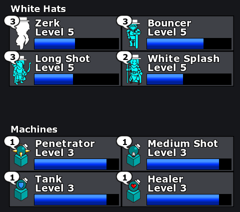
This already feels very good and it's already helping to lower the perceived mental load when playing with these units. They look like towers and their animations are much more spare, so they feel like units you put down to do one thing and then mostly forget about them.
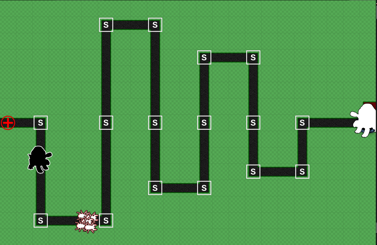
The next thing I'm working on is the mission that introduces the first machine minion, and I'm running into the same old problem from last month – trying to do too much which one level:
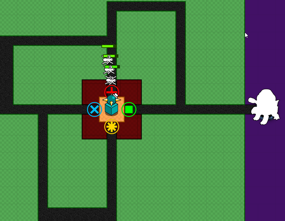
The entire premise of this level is that the heroes are going to stumble across the "Penetrator" machine, which fires projectiles in straight lines in all four directions. This level is trying to do waaaay too much – to perfectly demonstrate the capabilities of the unit I have had to add code to make the unit appear pre-summoned when the battle starts and then create way too clunky of a tutorial to orchestrate a very deliberate sequence of events, essentially turning a level into a cutscene. This isn't always out of the question, but it feels like a strong sign I'm doing too much.
Ultimately I decided the problem is with the design of this minion itself. This machine fires penetrating attacks along straightaways, which is unlike almost any other unit. Isn't the point of minions that they're supposed to have less cognitive load, and here I am starting with the weirdest and fiddliest one of them all?
The solution is just to go simpler. These are meant to be front line fill-out-the-ranks units so just do that. The other three are very easy to comprehend – "Medium Shot" who is a medium-ranged projectile attacker, "Healer" who is a support/healing unit, and "Tank" who absorbs damage and retaliates against attackers. The natural choice is to replace the "Penetrator" with something dead easy to understand, such as an AOE tower, and dispense with this convoluted level.
The special property of machines is that they have high health, no regeneration, and blow up when they die, taking out a bunch of enemies (they can reassemble themselves for their normal summon cost). A simple close-range unit like AOE is perfect for this because it should be pretty easy to contrive an intro level that both shows of its basic capabilities and then shows off its self destruct sequence at a natural opportunity without having to overcomplicate the tutorial scripting. Anyways, that's the current plan.
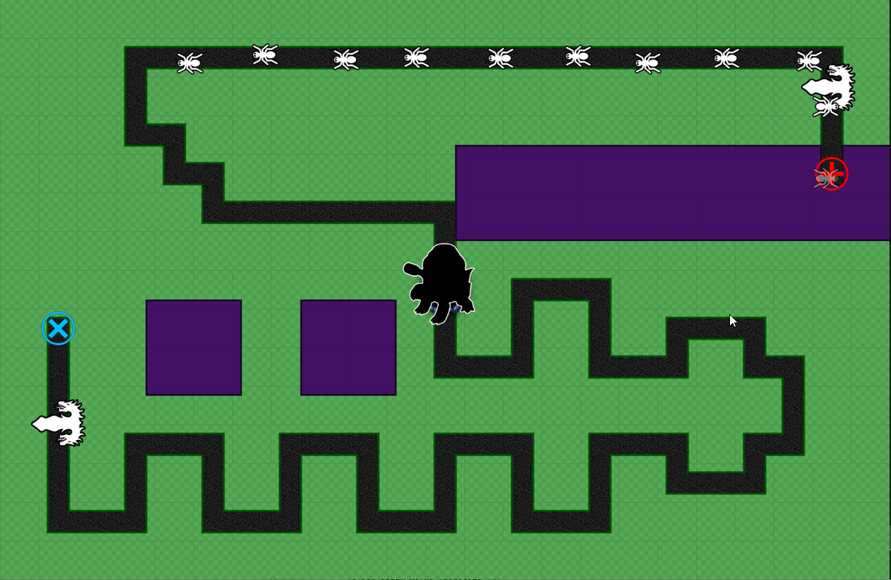
I did a similar overhaul of the placeholder art for the Black Hats' minions, the parasites:
Parasites are just meant to be extensions of their hosts, and I want each one to have a very obvious purpose. The parasite I'm just calling "Fighty" will just have a simple melee attack, but that melee attack will take on the particular flavor of whichever Black Hat hero you attach it too. Likewise "Shooty" will have a simple projectile attack, but what exactly it shoots will depend on who its host is. And so on. We're not going to do something as pedantic and literal as having icons painted on them in the final game, but the final art's visual language needs to be about that clear.
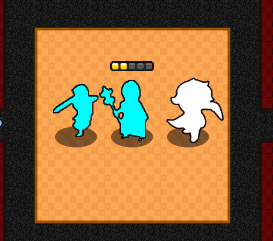
And while I was busy fixing placeholder art I went ahead and fixed up our boss art so that it communicates what it's supposed to. The White Hats' first battle is against the Black Hats themselves; in the story the Black Hats will be chasing them in their own ship:
And then later, when the Black Hats dust themselves off after their trouncing at the hands of the White Hats, they'll encounter their own boss monster to fight, the twin "Hydras". That's a placeholder name, but the whole point of this boss is that each one splits in half when you kill it, and each of those halves splits again after that. Re-using the purple Octopus sprite for both boss monsters was confusing our testers.
I did some more stuff than just mess around with placeholder art, though. I also tweaked the pacing a bit, adjusted the inventory of stores to get the pacing a bit better in response to tester feedback, tweaked a few levels, and fixed various bugs.
Another thing I did was dial in the notification text. For instance, the White Splash character has a damage-boosting "inspire" aura that they will constantly apply to friends in range – it's designed this way so you can't just apply the inspire once, recall the White Splash and move them somewhere else, and count on it to last. However, it made notifications super annoying because you'd see "+Inspire" floating over defenders' heads when it applied, and then it would wear off for a fraction of a second before being reapplied, and you'd see this "-Inspire" spam immediately followed by "+Inspire" again. I finessed this so that there's a buffer period where it won't show any notification if it gets re-applied fast enough. If you recall the White Splash and the friends go long enough without having the effect re-upped, then you'll see the "-Inspire" notification. I think these will be useful to people, but that requires making them dialed in so that they only tell you about information you really need to know, when you need to know it. And yes, I'll add an options menu choice to disable it eventually.
Another quality of life feature that's been asked for since DQ1: pause right at the start of each battle! A single click or keystroke will get you into the mission. This is so that you don't have to immediately freak out about enemies charging down the pipe before you've had a half second to even think.
And I did a few other minor things, but that's about all my lungs and brain could take this past month. One foot in front of the other towards the goal!
See you next month, and here's hoping we have no more medical adventures.